Before matchboxes became museum items or collector’s memorabilia, they occupied a far more intimate role in everyday lives: wedged between cigarette boxes, resting beside kitchen burners, tucked away in shirt pockets, and passed from hand to hand in the quiet rhythm of mundane life. A major part of India’s visual art culture lies outside art galleries and museums in ordinary objects such as the matchbox. From a mere disposable commodity, the matchbox turned into a tool for social messaging, documentation, and commentary, demonstrating how commercial art echoes the social and political atmosphere of the era.

In a country as diverse as India, with people from varied linguistic and educational backgrounds, images were the most democratic language that could be understood across social milieu. This was especially true for forms of print communication that were easily accessible, such as commercial images on everyday commodities like matchboxes, which were used by people regardless of their age, gender, or economic background.
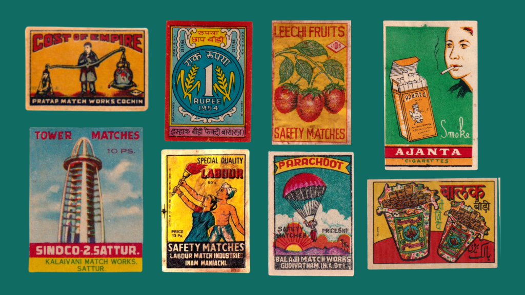
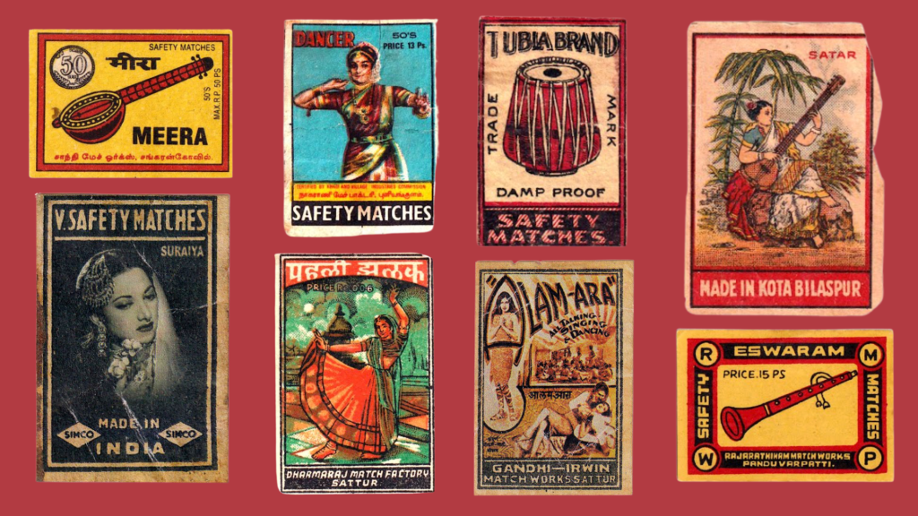
Initially imported from Europe in the late nineteenth century, matchbox labels were often limited to plain typography set against monochromatic and dual-toned backgrounds, or foreign motifs such as crowns, ships, and other commercial symbols. But as manufacturers began adapting these products for Indian consumers, matchbox labels underwent a noticeable shift. Minimal European aesthetics and generic symbols gave way to tigers, deities, and vernacular typography, motifs that resonated more deeply with Indian culture and society. The subtler shades of brown and beige were replaced by more vibrant and saturated colours: red, yellow, and blue. Through its visual language, the matchbox evolved from a generic consumer item to a commodity more localised to Indian society, an unconventional visual archive of Indian culture.
This shift coincided with the domestic production of matchboxes that began in the 1910s by Japanese immigrants in Calcutta. However, the practice soon expanded nationwide to places such as Sivakasi in Tamil Nadu, which is known as the match capital of India. Following the Swadeshi movement, everyday commodities were tied to ideas of self-reliance and nationalist identity and the matchbox was no exception to this trend. With increased local manufacturing, matchboxes turned into widely circulated palm-sized canvases bearing symbols of Indian culture. Several matchbox labels featured prints of symbols related to classical performing arts, such as dancers posing elegantly or musical instruments like the veena and tabla. Other labels depicted peacocks and tigers, the national animals of India, as well as iconic moments from popular culture and movie posters.
During the struggle for independence, iconography associated with the nation, such as the charkha, the Indian flag and depictions of Bharat Mata or Hind Mata became a recurring motif in labels. A roaring tiger, another prevalent symbol, was associated with ideas of strength, sovereignty, and freedom. With the turbulent political condition, the matchbox also played a direct part in political messaging. Matchbox labels featured bold typography of words such as ‘sovereign’ and messages like ‘azad India’ or ‘free India’. This was a way for nationalist symbols to enter everyday domestic spaces and contribute to the construction of a national identity amongst common people.
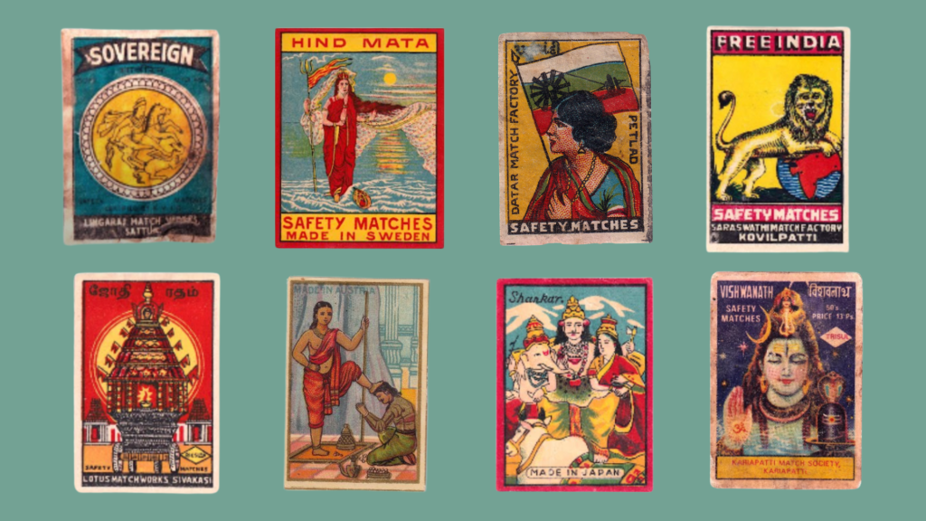
Religious iconography was another common motif in matchbox labels. Labels featuring Hindu deities were widely circulated, interweaving commerce with piety. This reflected the broader trend in Indian visual culture wherein religious iconography extended beyond devotional spaces and became ubiquitous in everyday items such as calendars, posters, and advertisements, blurring boundaries between the sacred and the mundane. Manufacturers relied on religious symbols not merely because it evoked religious sentiments, but also because it brought a sense of familiarity and cultural intimacy. As a result, a dispensable item turned into a cultural object that resonated emotionally with customers and brought comfort with every match. Following the establishment of his printing press, Raja Ravi Varma’s iconic oleographs were widely adapted for matchbox labels, transforming his exquisite mythological depictions into a miniature, everyday household commodity.
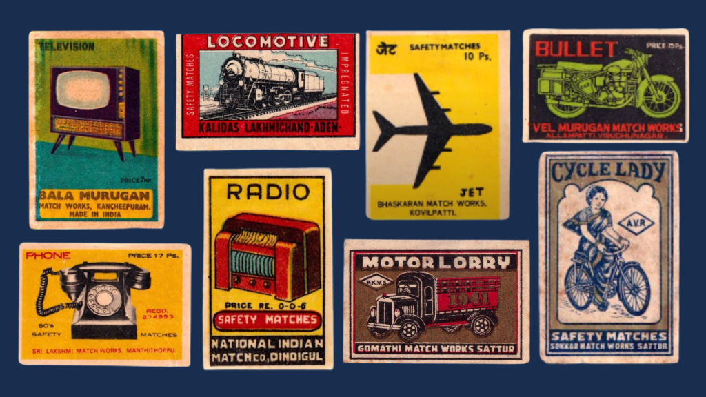
Matchbox imagery reflected another major aspiration of twentieth-century India: modernity. Labels featuring airplanes, factories, light bulbs, steam engines, bikes, etc. became increasingly popular. These designs echoed the developmental optimism of post-Independence India when industrialisation and development were presented as the paths to national progress. However, this idea of modernity was not restricted to technological development, but also extended to cultural ideology in society. An old matchbox label depicts a woman clad in a saree riding a bicycle, an act considered discordant with the traditional gender norms of those times. Thus, matchbox labels became a medium to comment on society and advocate for change. The matchbox disseminated the idea of modernity democratically to the citizens, giving them a tactile representation and promise of a modern nation.
In just a few centimetres of space, matchbox labels could convey more than commercials and posters, reflecting society through its distinctive visual language. Although used rarely now, matchboxes still endure in museums and the homes of collectors, presenting a unique visual archive of Indian history and the changing societal aspirations and fascinations, a reminder that art exists even in the ordinary.
Contributor